01 離散指数増殖モデル
世代の区切られた生物の個体数変動を差分方程式 (difference equation)で記述する. 本章では離散指数増殖モデル (discrete exponential growth model)を実装し,結果を見やすく可視化するためのプロット作法を学ぶ.
モデルの定義
世代 における個体数を ,1世代あたりの増殖率を とすると,
なら個体数は増加, なら一定, なら減少する.
実装
a,x,t をそれぞれ増殖率,個体数,世代とし,初期値から100世代分の時間発展を計算する.
# 01-01. 離散指数増殖モデル
import matplotlib.pyplot as plt
a = 0.1
x = 1
t = 0
t_list = [t]
x_list = [x]
for i in range(100):
t = t + 1
x = x + a * x
t_list.append(t)
x_list.append(x)plt.plot(t_list, x_list)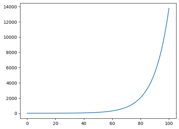
プロットを整える
研究で図を示すときには,色・線種・軸ラベル・解像度などの調整が欠かせない.以降では,前節で得た時系列データを使ってこれらの基本作法を確認する.
書式指定文字列で色と線種を変える
plt.plot の第3引数に 書式指定文字列(color + marker/line style)を渡すと,線とマーカーの見た目を一括で指定できる.
# 01-02. フォーマットの変更1
plt.plot(t_list, x_list, "ro")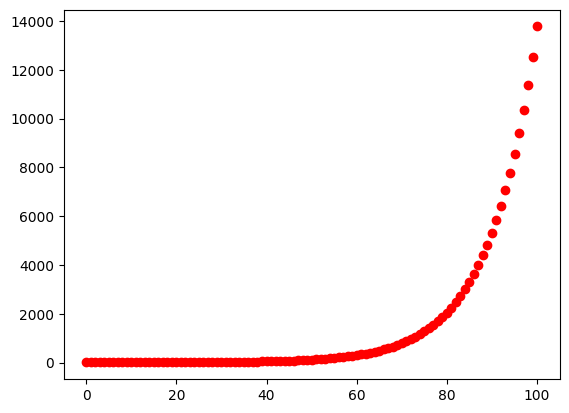
# 01-03. フォーマットの変更2
plt.plot(t_list, x_list, "k--")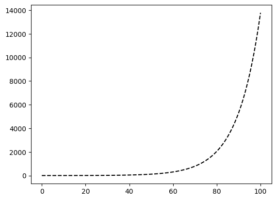
複数の系列を重ねる
plt.plot に (x, y) の組を複数渡すと,1つの図に複数系列を重ねて描ける.
同じデータを別のフォーマットでプロットしてみよう.
# 01-04. 複数のデータのプロット1
plt.plot(t_list, x_list, "-", t_list, x_list, "r.")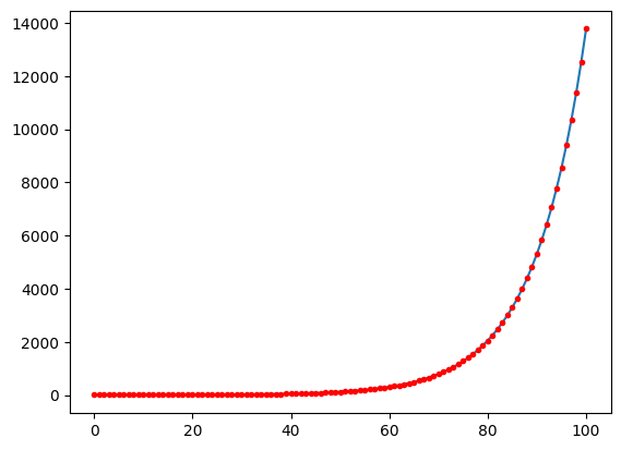
増殖率 を3通りに変えて時間発展を計算し,比較する.
# 01-05. 複数のデータのプロット2
x_lists = []
for a in [0.1, 0.11, 0.12]:
x = 1
t = 0
t_list = [t]
x_list = [x]
for i in range(100):
t = t + 1
x = x + a * x
t_list.append(t)
x_list.append(x)
x_lists.append(x_list)plt.plot(t_list, x_lists[0], t_list, x_lists[1], t_list, x_lists[2])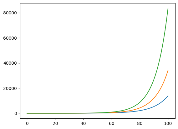
タイトルと軸ラベル
plt.title,plt.xlabel,plt.ylabel で図の意味を明示する.fontsize で文字の大きさも調整できる.
# 01-06. タイトル・軸ラベル1
plt.plot(t_list, x_list)
plt.title("Exponential growth")
plt.xlabel("Time (t)")
plt.ylabel("Pop. size (x)")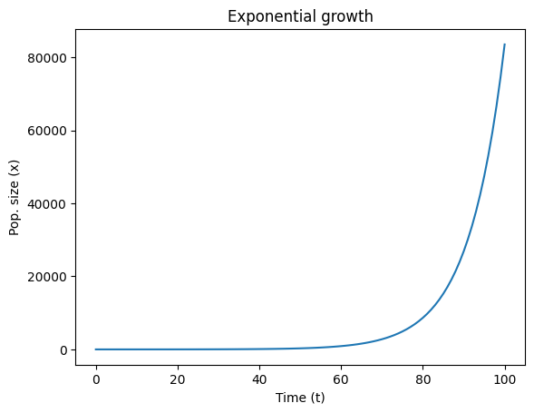
# 01-07. タイトル・軸ラベル2
plt.plot(t_list, x_list)
plt.title("Exponential growth", fontsize="xx-large")
plt.xlabel("Time (t)", fontsize="x-large")
plt.ylabel("Pop. size (x)", fontsize="x-large")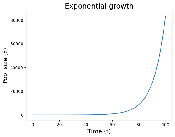
解像度と図サイズ
plt.figure(dpi=...) で解像度,figsize=[幅, 高さ](インチ)で図のサイズを指定する.
# 01-08. 解像度の変更
plt.figure(dpi=200)
plt.plot(t_list, x_list)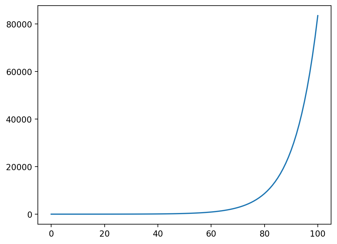
# 01-09. プロットサイズの変更
plt.figure(figsize=[5, 7])
plt.plot(t_list, x_list)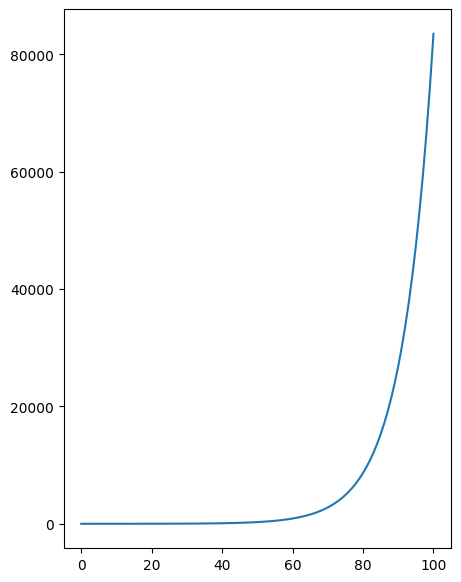
線とマーカーを重ねる
線とマーカーを同じ系列に重ねると,計算点と曲線形状の両方が読み取りやすくなる.
# 01-10. 離散指数増殖モデル2
a = 0.1
x = 1
t = 0

t_list = [t]
x_list = [x]
for i in range(100):
    t = t + 1
    x = x + a * x

    t_list.append(t)
    x_list.append(x)
plt.figure(dpi=200)
plt.plot(t_list, x_list, "-", t_list, x_list, "r.")
plt.title("Exponential growth", fontsize="xx-large")
plt.xlabel("Time (t)", fontsize="x-large")
plt.ylabel("Pop. size (x)", fontsize="x-large")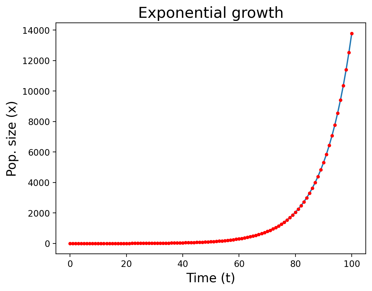
演習
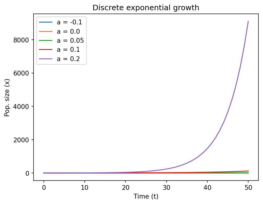
Solution to Exercise 1
plt.figure(dpi=150)
for a in [-0.1, 0.0, 0.05, 0.1, 0.2]:
    x = 1
    t = 0
    t_list = [t]
    x_list = [x]
    for i in range(50):
        t = t + 1
        x = x + a * x
        t_list.append(t)
        x_list.append(x)
    plt.plot(t_list, x_list, label=f"a = {a}")

plt.title("Discrete exponential growth")
plt.xlabel("Time (t)")
plt.ylabel("Pop. size (x)")
plt.legend()